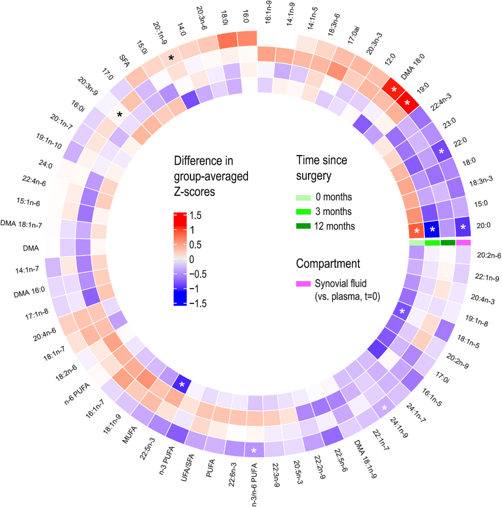
Differences in fatty acid (FA) profiles of plasma and synovial fluid (SF) extracellular vesicles determined from gas chromatography–mass spectrometry lipidomics. In this chart, the results are presented as color-coded differences in group-averaged Z-scores between: knee osteoarthritis (KOA) plasma before surgery and control plasma (innermost layer); KOA plasma at 3 months post-surgery and before surgery (second layer); KOA plasma at 12 months post-surgery and before surgery (third layer); and KOA SF and KOA plasma before surgery (outermost layer). From Mustonen et al, BBA Mol. Cell Biol. 2025
Dimensionality reduction and clustering of high-content samples
Expression of three submodules within the G1/S regulatory network during healthy human hematopoiesis (bottom) Hematopoietic cell types are represented on the top left map. UMAP realized based on AUCell scoring of the enrichment of genes subsets in single cell RNA-sequencing data. Fromhttps://www.biorxiv.org/content/10.1101/2025.05.15.654268v1
Correlations analysis in epidemiology
Analysis of spatially-resolved epidemiological data during the Covid19 pandemic. Contrasting effective reproduction number (Rt) versus residential mobility correlations identifies 3 groups of countries. (A) Rt versus mobility indicators (Pearson R coefficient; y-axis, as output by the Pearson tests) as a function of time-lag (x-axis) for 1 exemplary country of each group: Austria (left, group 1), Bolivia (middle, group 2), and Ecuador (right, group 3). All mobility indicators are shown with the indicated colors. (B) Map of the world showing countries/regions in group 1 (negative Rt vs. residential mobility, green), group 2 (positive Rt vs. residential mobility, red), and group 3 (complex patterns, pink). The map was generated with mapchart.net. Countries/regions where data were not available or insufficiently documented are shown in gray (see Methods). From Ould Setti and Tollis, J. Prev. med. and public health 2022
Correlations analysis and hierarchical clustering of samples and genes/markers
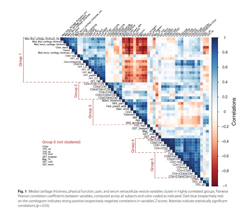
Analysis of correlations between medial cartilage thickness, physical function, pain, and serum extracellular vesicle variables showing that those variables cluster in highly correlated groups. Pairwise Pearson correlation coefficients between variables, computed across all subjects and color-coded as indicated. Dark blue (respectively red) on the correlogram indicates strong positive (respectively negative) correlations in variables’ Z-scores. Asterisks indicate statistically significant correlations (p < 0.05). From Mustonen et al, Arthritis Research and Therapy 2024
Machine Learning
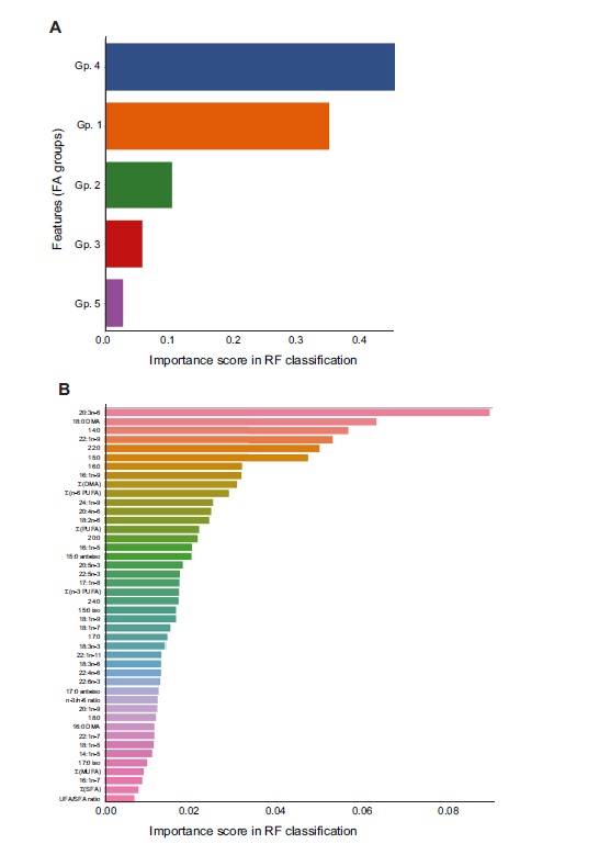
Random forest (RF)-based classification of knee arthritis diagnosis based on markers from synovium samples. In panel A, bar chart shows the feature importance score of each FA group (Gp.) in the RF-based classification of the diagnosis of the samples. The presented scores are averages of the FA group importance scores over 100 RFs of 100 trees each, run on a 1000-fold enriched dataset. In panel B, bar chart shows the feature importance score for each individual FA, sum, or ratio in the RF-based classification of the diagnosis of the samples. The scores presented are averages of the FA importance scores over 100 RFs of 100 trees each. From Mustonen et al, Inflammation 2023