3D reconstructions from fluorescence microscopy images
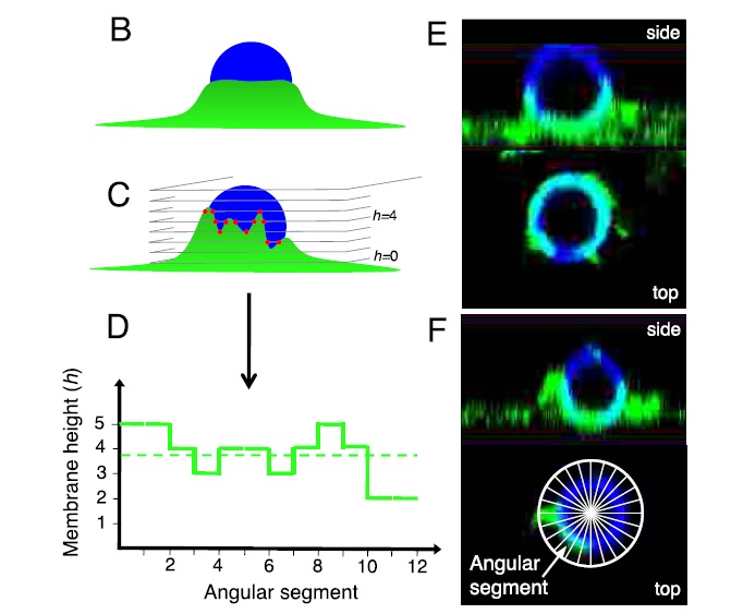
Image analysis of phagocytic cups, using fluorescence images of COS-7 cell in which FcgR-GFP shown in green and IgG antibodies on 1.5 μm-radius particles shown in blue. (B, C) Illustrative schematics of 3-dimensional confocal fluorescence microscopy images. (B) Schematic (side view) of a regular cup. (C) Schematic (side view) of a variable cup. From the intersections of the confocal imaging planes with the phagocytic cup, the maximal height of the cell membrane is determined for each angular segment around the particle (red dots). (D) Membrane height as a function of angular segment (see inset in panel F), corresponding to the cup drawn in panel B (dashed line) and C (solid line). Only the angular segments from index 1 to 12 out of 24 are shown. The variability of the cup is defined as the standard deviation divided by the average of this function. The higher this measure, the more variable the cup. (E, F) Side and top views of half-engulfed particles, with cups reconstructed from confocal microscopy data. (E) Top view, taken in the equator plane of the particle, shows a regular distribution of cell membrane (receptors) around the particle (regular cup). (F) Top view shows an irregular distribution of cell membrane (variable cup). Inset Schematic defines the angular segments (in top view). From Tollis et al BMC 2010
Protein localization analysis from 2D fluorescence images
Example of telomere hyperclusters colocalizing with the nuclear membrane. (A) Telomere hyperclusters (Sir2-GFP) display slower MSDs in WT quiescent cells (7 d, red line) than in proliferating G1 cells (green line). (B) Telomere hyperclusters colocalize with the nuclear membrane. WT quiescent cells (7 d) expressing Nup2-RFP (red) and Sir2-GFP (green, left panel) or Sir3-GFP (green, right panel). (C and D) Telomere hyperclusters are distributed non homogenously around the quiescent cell nucleus periphery. (C) WT quiescent cells (7 d) expressing Sir2-GFP (green) and Bim1-RFP (red), a protein localized along the nuclear microtubule bundle, were used to analyze telomere hypercluster localization. The mean number of detected Sir2-GFP foci per cell and the percentage of cells displaying nuclear microtubule bundle in the population are indicated. (D) Left, schematics showing edge-based detection of telomere hyperclusters and nuclear microtubule bundle position. Right, Sir2-GFP localization (top, blue dots) and the corresponding heat map (bottom) are shown. In the two panels, a sum of nuclear volume 3D projections using the nuclear microtubule bundle (green) as an oriented symmetry axis reference (the SPB been the origin, yellow arrow) is shown. From Laporte et al MBoC 2016
Protein co-localization analysis from fluorescence images (in 3D)
Colocalization of Myosin and F-actin in 3D phagocytic cups. COS-7 cells expressing FccR and GFP-Myo1G were challenged with IgG-opsonised 3 or 6 mm particles for 15 minutes in the presence of 50 mM of the PI3K inhibitor LY294002. The recruitment of GFP-Myo1G to phagocytic cups was quantified as the percentage of positive phagocytic cups. (B) Spatial distribution of Myo1G and F-actin in phagocytic cups around 6 mm particles. Shown are cross-sections for DMSO-treated cells at three time points of phagocytic challenge (6, 8 and 10 minutes in Bi, Bii and Biii, respectively) and for LY294002-treated cells for partial (Biv) and almost full engulfment (Bv). Fluorescent intensities were rotationally averaged over several cups. The large yellow circle represents the particle, and the white contour shows the cup boundary. (C) Histograms of Pearson’s correlation coefficient in nearly completed cups demonstrating Myo1G localisation in cups with (green) and without (blue) inhibitor treatment. *P,0.05, ***P,0.001. From Dart, Tollis et al, JCS 2012
Analysis of collective motion of cells from fluorescence microscopy videos
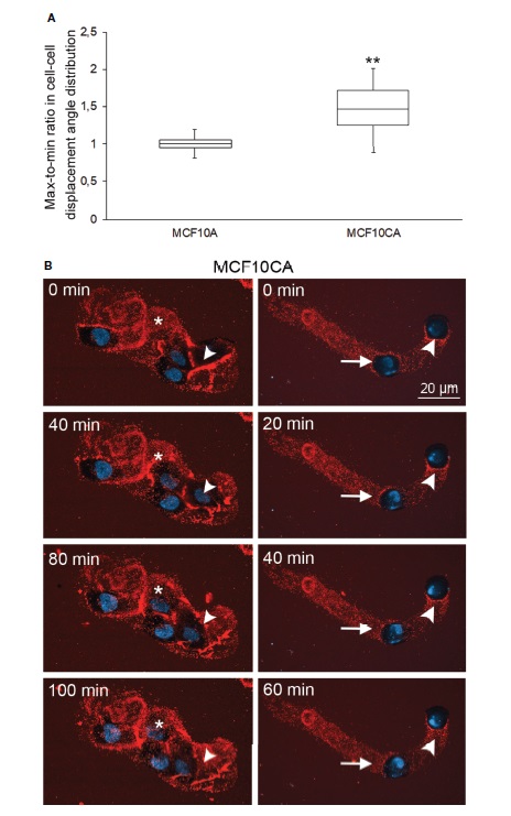
Analysis of collective cell motion in cancer and normal cells from timelapse imaging. Whisker and box plot showing the distribution of correlation index (CI) for MCF10A (left) and MCF10CA (right) cells (A). Plots were constructed using data from 11 Fields of View (FOVs). The CI of each FOV was normalized to the median CI of normal cells for the same experiment. **: Wilcoxon rank-text p-value p=0.0151. Two examples of collective migration of live MCF10CA cells along trails are shown in (B). Asterisks (*) indicate the hyaluronan-rich tracks secreted by leading cells, and that that other migrating cell follows, and arrowheads show the trail that a moving cell leaves behind (left panel in B and Supplementary Movie 2). The right panel in B and Supplementary Movie 2 show an example of leader-follower behavior, where the original position (0 min) of the leader cell is indicated by an arrowhead and the follower cell by an arrow. Red = hyaluronan and blue = nuclei. From Aaltonen et al Frontiers 2022
Analysis of single molecule trajectories (with MSD and JDD techniques)
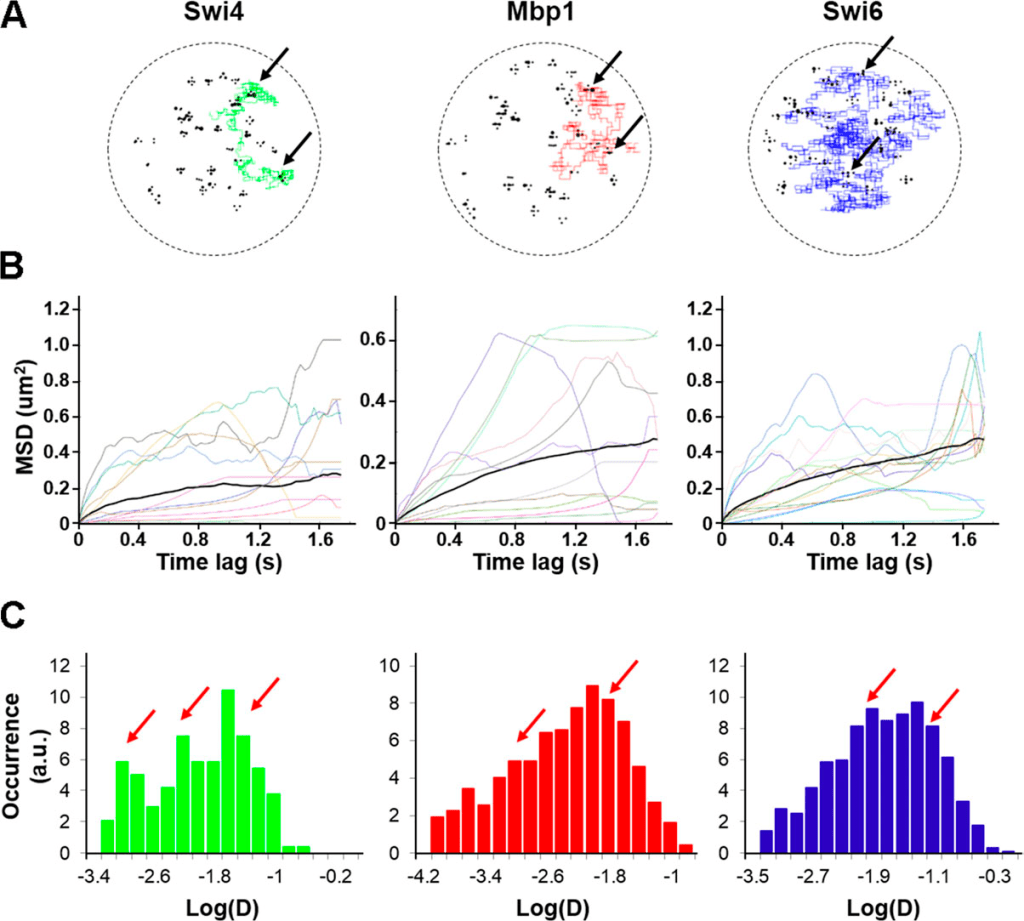
Analysis of multimodal dynamics of Swi4, Mbp1, and Swi6 transcription factors with MSD analysis. (A) Example trajectories of individual Swi4 (left, green), Mbp1 (middle, red), and Swi6 (right, blue) dimers, showing for each dimer particle alternations between anomalous sub-diffusive motion confined within cluster and fast, freely diffusive motion between clusters. Black circles represent DNA G1/S promoter target sites. Black arrows indicate positions of multiple binding/unbinding events within given promoter clusters. (B) Example of Mean Square Displacement (MSD) versus time lag curves corresponding to individual Swi4 (left), Mbp1 (middle), and Swi6 (right) dimer trajectories (color curves). The thick black curves represent the MSD averaged over all the trajectories for each protein. Computation of MSD curves were restricted to the steady-state section of each trajectory, corresponding to simulated times beyond 0.6 s from the onset of the simulation. (C) Histograms of single trajectory diffusion coefficients extracted from the slope of linear fits of the first four points of individual MSD curves from B. Red arrows indicate the approximate positions of main peaks underlying the distribution. From Black, Tollis et al JCB 2020Analysis of multimodal dynamics of Swi4, Mbp1, and Swi6 transcription factors with Jump Distance Distribution (JDD) analysis. (A and B) Trajectory length distributions for sptPALMon (A) Swi4-mEos3.2 and (B) Mbp1-mEos3.2 in live cells. JDDs for Swi4 (dotted lines), Mbp1 (filled lines), and Swi6 (dashed lines) single molecules in fixed cells (C and E) as a control for instrument jitter and (D and F) in live cells. Colors in all JDD distributions correspond to cells grown in SC + 2% glucose medium (blue) and SC + 2% glycerol medium (red). (C and D) Distributions of jump distances over large times (570 ms and 510 ms, respectively, for fixed and live cells with 20 and 18 points, respectively). (E and F) distributions of jump distances over shorter times (210 ms, eight-point trajectories for both fixed and live cells). Red arrows indicate occurrences of large jumps in live cells distributions that exceed confined diffusion black arrows).From Black, Tollis et al JCB 2020
Analysis of single vesicle dynamics
Single vesicle tracking in exocyst mutants reveals exocytic dynamics similar to that of endocytic mutants. (A) Top, vesicle trajectories in small-budded control and sec6-4 cells expressing mEos-Sec4. Lower (D = 0.01–0.03 μm2/s) and higher (D > 0.1 μm2/s) mobile vesicle trajectories are shown in cyan and magenta, respectively. Bottom, heat maps of D of exocytic vesicles in control and sec6-4 cells. (B) Normalized histograms of log D of exocytic vesicles in control cells (black) and sec6-4 (blue) mutants. (C) Cumulative probability distributions of log D of exocytic vesicles in control cells (black) and sec6-4 (blue) mutants. (D) Average MSD curves for control cells (black) and sec6-4 mutants (blue). (E) Percentage of cells displaying interspersed endocytic and exocytic trafficking domains in different exocyst mutants. From Jose et al MBoC 2015